Project
NYC Interactive Happy Hour Map
STACK: Tableau, Python
A user friendly way to visualize happy deals in the local area.
NYC is full of happy hour deals, spanning all five boroughs and everyday of the week. Various online forums have compiled crowd-sourced lists of deals, usually categorized by area. But, unless your someone who knows the location of every bar in your area, skimming through the list to try and find deals in walking distance, on the right day and at the right time is a tedious task. I decided to compile this information into one easy to use dashboard where users can visualize the deals near them, as well as filter by day, time and type of deal.
Data Collection and Structuring
The source data consisted of free-text deal descriptions collected from online lists. Using Python, I built a lightweight data pipeline to extract structured information from these descriptions. The pipeline produced a normalized table with one row per venue per day, including start and end times and binary flags for deal categories.
The most common deal types identified were:
Cocktails and well drinks
Beer
Wine
Oysters
Food and miscellaneous specials
Geocoding and Data Quality Challenges
To map venues, I used the Awesome Table geo-coder to populate latitude and longitude values based on venue name and address. Because the data was crowd-sourced and not actively maintained, this step introduced several challenges.
In many cases, venues had closed or changed names, causing the geocoder to return incorrect coordinates. In other cases, venues were incorrectly labeled as belonging to the wrong neighborhood. To identify and correct these issues efficiently, I applied a color-coding scheme to the map, assigning each neighborhood a distinct color.
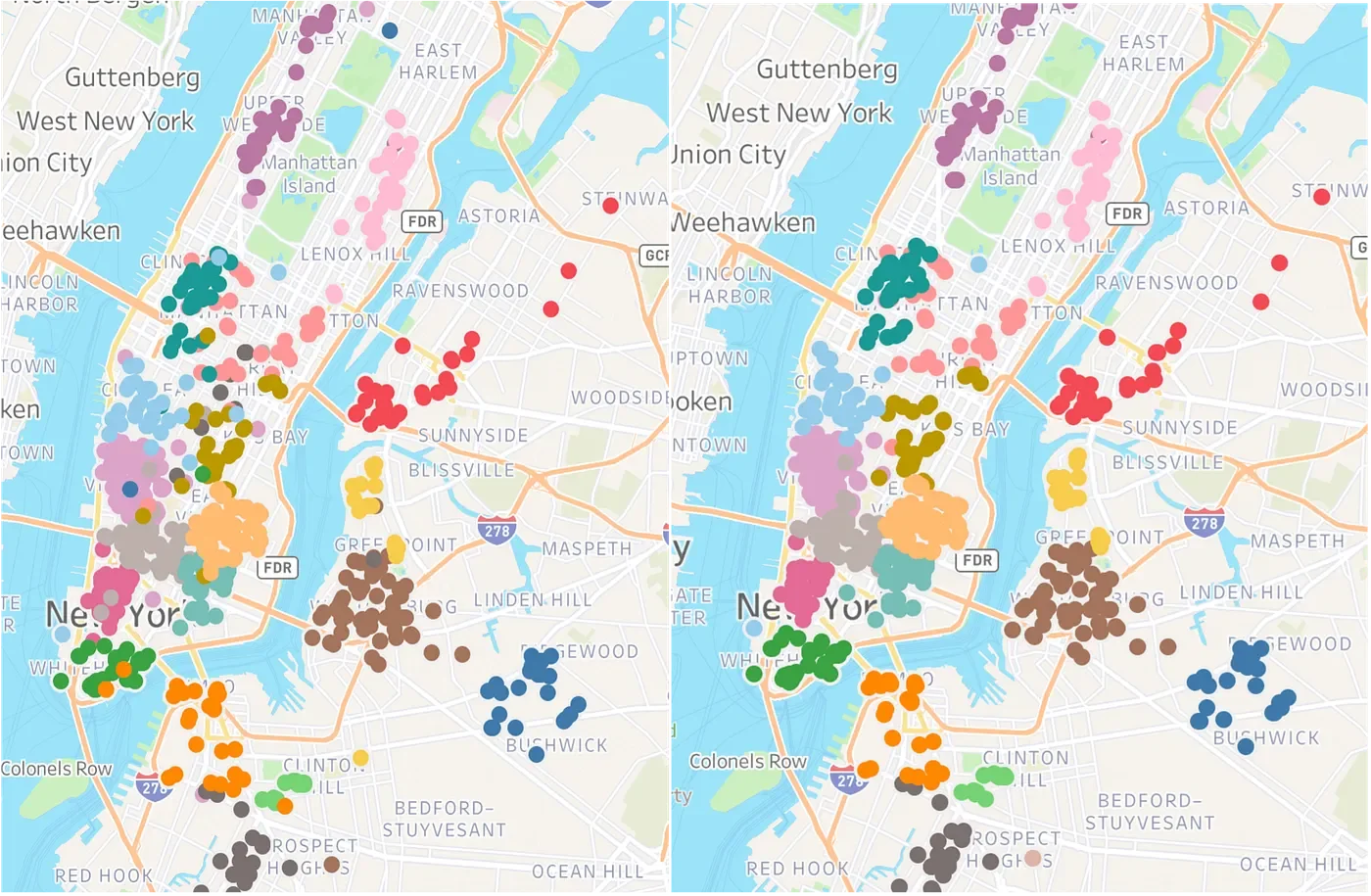
This made errors visually obvious. For example, a Financial District color appearing in Midtown immediately flagged a potential issue. I manually reviewed these cases. When coordinates were incorrect, the venue had usually shut down. When colors were incorrect, the venue had been mislabeled in the original source. This visual validation step significantly improved data accuracy while keeping the cleaning process manageable.
Filtering Out Inauthentic Deals
Some listings contained vague descriptions such as “cheap beer” without a defined price or structure. Since these were not actionable deals, I filtered out rows that did not contain common deal indicators such as dollar amounts, percentages, or patterns like “2-for-1”. I then reviewed edge cases manually to avoid removing valid entries.
Dashboard Design and Interactivity
The final dataset was visualized in Tableau. I built the dashboard to support real-world decision making rather than static exploration. Users can filter by:
Day of the week
Time of visit using a parameter-driven calculated field
Deal type, including beer and wine, cocktails and wells, food, or oysters
I also added a live counter showing how many establishments match the current filters, giving immediate feedback as users explore options. I made sure to add a disclaimer that all deals are crowd-sourced and not verified, and invited users to report incorrect data and to submit deals to be added.
The result is an intuitive, map-based tool that transforms unstructured, difficult-to-use listings into a practical way to discover happy hour deals across NYC.